I’ve been spending a little time in the evening delving back into the photos I’ve scanned. It’s frustrating: I have small images, and they don’t create a lot of data for Lightroom to manipulate. Still, I’ve got a workflow for them now, and I’m more and more pleased with the results.
Some fixes are easy; some are tedious.
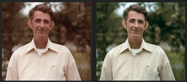
Uncle Dinky (never once did I call him by anything other than the nickname he’d had for most of his life) looks a lot better with a little work. Had to correct some colors a bit, but not much. I focused on getting his face bright and clear.
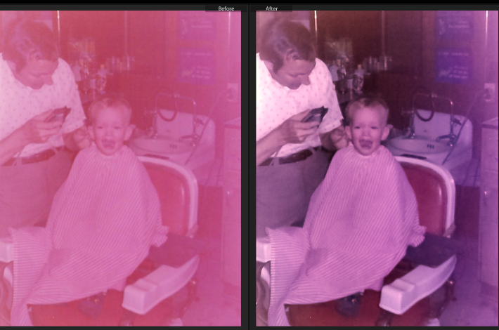
I’m most pleased with the tricks I’ve learned for the old red photographs that are so ubiquitous.
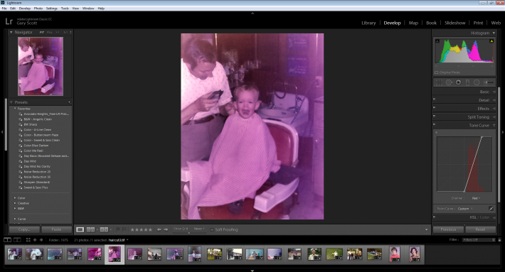
Look at that tone curve for reds: everything is in the mid-ranges. No red in the shadows; no red in the highlights. The same is always true for blue and green. I’m not sure how that all combines to give a red tint to everything, but I’ve found a solution: recalibrate the tone curve for each color and voila! It’s a semi-decent picture. Unfortunately, though, each picture’s tone curve skew is different, so creating a preset to do the work with the click of a button isn’t an option. I have to correct each color of each photograph manually.
0 Comments