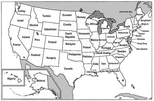
Via Kerim at Keywords, who found it at Strange Maps.

It is a bit misleading, though, as Strange Maps explains:
The creator of this map has had the interesting idea to break down that gigantic US GDP into the GDPs of individual states, and compare those to other countries� GDP. What follows, is this slightly misleading map � misleading, because the economies both of the US states and of the countries they are compared with are not weighted for their respective populations.
Pakistan, for example, has a GDP that�s slightly higher than Israel�s � but Pakistan has a population of about 170 million, while Israel is only 7 million people strong. The US states those economies are compared with (Arkansas and Oregon, respectively) are much closer to each other in population: 2,7 million and 3,4 million.
All the same, fascinating.
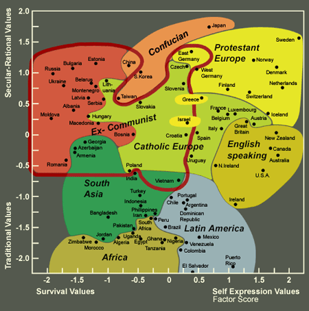
I went to Strange Maps myself (obviously) and found a map much more interesting, in my view: the Inglehart-Welzel Cultural Map of the World.

How to read the map?
On this map, East and West Germany are next to each other, as one would expect. But Romania�s closest neighbour is Armenia? And Poland and India are side by side? Well, this is not a straightforward geographical map, but a cultural one. It plots out how countries relate to each other on a double axis of values (ranging from �traditional� to �secular-rational� on the vertical and from �survival� to �self-expression� on the horizontal scale). This makes for some strange bedfellows � for example: South Africa, Peru and the Philippines occupy almost the same position, although they�re on three different continents.
If I were a social studies teacher…